
ok one last tweak
good job with getting the images to me, they all look well gid.
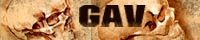
i Think the banner that you did ken is kick ass.
i was mucking around with fonts and this is just another idea i wanted to run by you. obviously it would be better if you did the art for the pencil guy for at the side cause he is your character, and you know how it is done etc. (i can totally vision you doing a nice ken style pencil dude.) also it would be in keeping with the blinking blog link you done.
chris

posted by CGMarshall @ 5:10 PM
7 comments
![]()


7 Comments:
this new skin makes me want to post more than ever it still has some tweaking like the banner but i think it a big step in the right direction.
it looks really good imo.
you can ignore this if u guys want - but my biggest problem with it is the thin loud orange lines around the boxes and stuff. If you can drop the chroma of it down a bit so its not fighting with the orange of doodly moodly banner?
just a thought....
looks cool otherwise tho
cheers
g
MAN! YOU ROCK! thats amazing, the banner is much better than the one i had done, i think we should use this! Yeh sound ill do a new pencil guy and bounce it to ya, see how it looks, but im really liking the look of this! yeh here here!
Ken :D
PS.... i might have to make some changes to my biography link.. the black border makes it look smaller! will email ya with my new image :D
ken
sound sound. it looks so much better than the old black.
some time gav you could send another image to me it. would look a lot better if everyone had a roll over image. i have a few belters on my computer remember when you pulled all thoses crazy faces. lol
Man those pics are mental.
I was in a really funny mood then.
You did some amazing face work on
"storm of the iron fist"
did you not?
lol
Post a Comment
<< Home